
Views: 0 Author: Site Editor Publish Time: 2026-08-17 Origin: Site


Translating a crisp 2D vector file into a 3D physical object carries hidden dangers. Procurement managers face a constant risk during custom production runs. Muddy, illegible text often ruins otherwise perfect items if the manufacturing specifications miss the mark. True legibility relies on the subtle interplay of shadow and light. Manufacturers control this contrast directly through the precise depth of the die.
Incorrect depths blur vital text and waste thousands of dollars. You cannot fix illegible metal after the initial strike or casting. This article delivers the technical benchmarks you need. We break down the exact variables controlling readability across different metals. You will learn how to evaluate manufacturer capabilities accurately. By understanding these mechanics, you will avoid costly production errors right from the design phase.
Legibility in unpainted metal operates differently than printed paper. It relies entirely on physical shadows rather than color contrast. When light hits a sculpted surface, it illuminates the peaks and darkens the valleys. Shallower cuts produce much weaker shadows. This weak contrast causes text to blend completely into the background. You must engineer enough depth to force distinct shadow lines.
Designers constantly debate stamping text into the surface versus projecting it outward. Recessed text involves pressing letters downward into the base material. While aesthetically unique, it frequently struggles in low light. Conversely, using raised lettering remains the absolute industry standard for readability. It catches ambient light from multiple angles beautifully. However, it requires a highly specific die depth to execute cleanly without distortion.
Insufficient depth triggers a major manufacturing defect known as the bleed problem. Electroplating and polishing add microscopic layers of material over the raw core. These finishing processes naturally fill in shallow valleys. If your letters lack adequate separation, they pool together. This pooling destroys the legibility of your commemorative medal design. A properly calculated metal medal relief prevents finishing liquids from bridging the gaps between delicate characters.
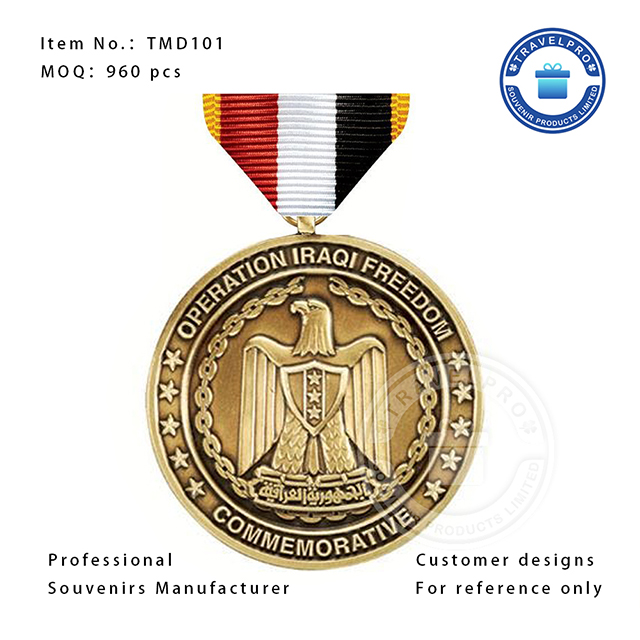
Industry standards segment depths into three distinct categories. You must match your typography requirements to the correct category. Choosing the wrong specification guarantees visual failure.
Table: Manufacturer Specifications for Production Legibility
| Relief Category | Depth Range (mm) | Best Application Use Case | Typography Risks |
|---|---|---|---|
| Low | 0.5mm - 0.7mm | Budget-conscious, high-volume bulk orders | High risk for serif fonts or sizes under 8pt |
| Standard | 0.8mm - 1.5mm | Corporate awards, athletic medallions | Struggles to define complex overlapping elements |
| High | 1.5mm - 3.0mm+ | Premium collector pieces, portrait depictions | Demands thicker base metals and increases die fees |
Low relief spans from 0.5mm to 0.7mm. It works best for budget-conscious, high-volume orders. You should only use large, simple fonts here. It carries a severe risk of illegibility for fonts under 8pt. Delicate serif typefaces lose their tails entirely during the strike. They simply lack the structural mass to survive the stamping process.
Standard relief measures between 0.8mm and 1.5mm. It suits the vast majority of corporate and athletic awards. This depth provides crisp, clean shadow drops for text. It defines edges sharply against flat backgrounds. However, standard depth may struggle to define overlapping elements. For example, a banner crossing over a dense logo often blurs at this depth.
High relief pushes boundaries from 1.5mm up to 3.0mm or more. It dominates premium collector pieces and challenge coins. It excels at architectural and portrait depictions. A massive souvenir medal relief height creates stunning realism. But it carries distinct risks. It increases initial die fees significantly. It demands a much thicker base metal. It also slows down production times due to reduced strike rates.
Intricate designs demand intense spatial planning before tooling begins. A highly detailed coat of arms medal requires multiple distinct visual planes. You need the shield, crest, supporters, and motto to stand apart clearly. If you compress these elements into a single plane, the entire graphic collapses into a muddy lump.
You must differentiate between flat-layered 2D and true 3D die sinking. A 2D mold creates a harsh stair-step effect. It stacks flat layers rigidly on top of each other. True 3D methods utilize sculpted, curved edges. CNC machines carve smooth transitions between elements. This organic curvature catches light naturally and enhances fine text dramatically.
Text integration requires strict discipline within complex geometry. You should establish clear guidelines for placing text. We strongly recommend keeping primary text on the flat outer border. This area is known as the exergue. Never overlay tiny letters onto the highest sculpted points of a crest. Placing text on uneven peaks compromises structural integrity. It causes uneven polishing and ruins readability completely.
Your chosen base metal strictly dictates what your manufacturer can achieve. You cannot force a material past its metallurgical limits.
Die-struck brass and copper behave differently than cast zinc alloy. Brass holds incredibly sharp text edges at shallower depths. However, it possesses a lower maximum ceiling. Pushing brass into deep recesses requires multiple expensive strikes. The metal hardens after each hit. Conversely, zinc alloy flows beautifully into deep molds. It achieves extreme heights cost-effectively. But zinc edges soften slightly as they cool. You must use slightly larger font sizes to maintain readability in cast zinc.
Enamel applications introduce severe interference risks. We warn designers constantly against the enamel flood. If you add soft or hard enamel to the background, you fill the empty space. This essentially swallows your text. You must engineer specific depths to combat this.
Finishing processes completely alter visual contrast. Antique finishes settle deeply into recesses. They artificially darken the background. This greatly enhances readability on low-profile pieces. In contrast, highly polished finishes like bright gold cause intense glare. Harsh reflections wash out shallow text. You must demand deeper tooling to remain legible under bright lighting conditions.
Evaluating vendor capabilities prevents disastrous production runs. You must enforce strict verification protocols before approving any tooling fees. Never accept a simple 2D digital proof for a complex order.
Ask potential vendors direct, technical questions. Ask them: "What is your standard die depth for this specific diameter and thickness?" This reveals their default engineering habits. Ask them: "Do you recommend a 2D or 3D mold for this specific typography?" This tests their understanding of spatial layering. Finally, ask: "Will the chosen plating and enamel combination obscure a 1.2mm depth?"
Watch carefully for severe red flags during negotiations. Be highly skeptical of manufacturers who promise deep detail on ultra-thin base metals. A piece under 3mm total thickness cannot support deep stamping. The immense pressure pushes the metal completely through. This leads to severe warping. It ruins the reverse side and creates a defective batch.
Legibility operates as a strict, measurable engineering variable. It goes far beyond simple design aesthetics. If you ignore physical shadows and material constraints, your text will fail. Precision planning eliminates these costly manufacturing defects entirely.
Always default to a 1.2mm minimum depth for standard typography. This guarantees clean shadow drops under normal lighting conditions. Escalate to complex 2D or 3D depths only when intricate geometric designs demand it. Keep a close eye on how your finishing choices interact with your chosen metal.
Take action before finalizing your next order. Consult your vector design file with a dedicated technical specialist. Calculate the exact mold dimensions required for your specific typography. Lock in these specifications before initiating any high-volume production run.
A: Generally, avoid fonts smaller than 5pt or 6pt. Sans-serif fonts are highly recommended, as delicate serif tails are often lost regardless of relief height. The stamping or casting process cannot hold enough material to form microscopic decorative edges cleanly.
A: Yes. Antique finishes artificially create contrast by darkening the background. This allows you to achieve excellent legibility even with slightly shallower relief compared to high-polish finishes. The dark residue settles in the valleys, framing the bright text perfectly.
A: High relief requires thicker base metals, more complex CNC die-cutting (or hand-sculpting), and for die-struck pieces, involves slower press operation or multiple strikes with annealing processes in between. Deep molds also wear out faster, increasing tooling maintenance costs.

