
Views: 0 Author: Site Editor Publish Time: 2026-10-09 Origin: Site


Translating a beautiful digital design into a physical metal product is rarely a direct copy-paste process. You must account for specific manufacturing variables when moving from two-dimensional files to raw metallic surfaces. Materials like brass and zinc alloy interact uniquely under varied lighting and structural stress.
Poorly optimized files often lead to compromised details and unexpected color shifts during production. These avoidable errors usually delay production timelines significantly while manufacturers request revised assets. Factories cannot magically fix a blurry image or a structurally unsound sketch without proper technical guidance.
This guide provides a definitive framework for evaluating your source files before manufacturing begins. You will learn how to select the appropriate production technique for your specific project design. We will also cover exactly how to verify manufacturer proofs before you commit to large-scale production runs.
Understanding the fundamental difference between vector and raster graphics determines the success of your final piece. Vector files, such as AI, EPS, or SVG formats, use mathematical equations to map out lines and shapes. We rely on vectors for logos, typography, and precise line art because they scale infinitely without losing quality. Manufacturers require vector paths to create clean stamping molds and guide laser engraving heads.
Raster images, including JPEGs and PNGs, consist of fixed pixel grids. You should only use rasters for full-color photographs or highly complex digital illustrations. A major implementation risk occurs when designers attempt to upscale low-resolution web images for physical manufacturing. A 72 DPI image pulled from a website will look severely pixelated when printed or etched onto metal. If you must use raster files, ensure they render at a minimum of 300 DPI at their actual physical size.
Many projects begin as hand-drawn concepts or standard portraits. Translating these organic mediums into custom metal souvenir artwork requires intentional structural adaptations. When converting sketches, you must rely on heavy, deliberate line weights while eliminating soft pencil shading. Factories need distinct boundaries to create raised and recessed metal areas.
Standard photographs demand a different preparatory approach before metal engraving. You cannot simply submit an unedited photo from your smartphone. You must apply high-contrast filtering to separate mid-tones into distinct black-and-white values.
Common Mistake: Submitting a beautifully shaded charcoal sketch for a stamped pin. Soft shading cannot translate into a physical metal mold. You must convert these gradients into solid, enclosed vector shapes first.
Digital screens display colors using the RGB (Red, Green, Blue) model, transmitting light directly into your eyes. Physical manufacturing uses entirely different color models, primarily CMYK for printing or Pantone Solid Coated for enamel filling. You must convert your digital files from RGB to production-ready color spaces before submission to prevent unexpected dullness.
Color matching on reflective metal surfaces poses significant inherent limitations. A Pantone color approved on bright white paper will look darker when poured into a recessed zinc alloy cavity. We recommend setting realistic expectations regarding color vibrancy, as the underlying metal substrate will always influence the final perceived hue.
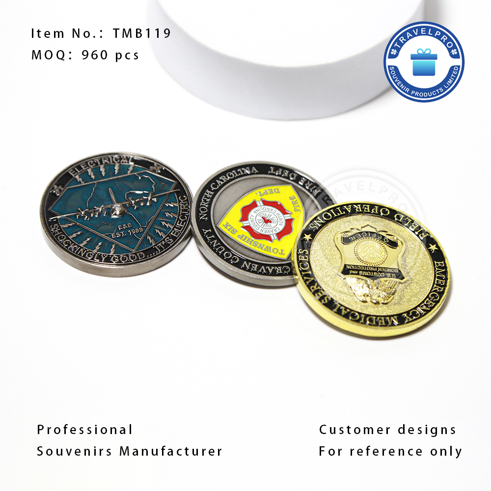
Die-stamping remains the traditional standard for creating durable, tactile products. This process excels when paired with bold lines, solid colors, and strong typographic designs. If you are crafting a standard custom metal badge, stamping provides an unparalleled premium feel.
This technique imposes strict artwork constraints. Stamped designs require closed metal borders, known in the industry as cloisons, to contain liquid enamel during production. Because liquid enamel colors mix if they touch, gradients and soft color transitions remain structurally impossible. Every color needs a distinct metal wall around it.
Laser engraving burns away the top layer of the metal surface to reveal the core beneath. This technique works perfectly for high-precision monochromatic designs, serialized corporate items, and minimalist aesthetics. It offers a sophisticated, understated appearance.
Engraving relies entirely on black-and-white contrast for visibility. The laser head operates with a minimum burn radius, typically around 0.15mm. If your design features lines thinner than this threshold, the laser will simply burn the details away into an illegible blur.
Modern printing technologies allow manufacturers to apply ink directly onto flat metal surfaces. Sublimation and UV printing stand out as the best options for reproducing full-color photographs or intricate gradients on a flat souvenir gift. This method completely bypasses the limitations of metal molds and enamel walls.
However, printed artwork carries structural vulnerabilities. The ink sits on top of the metal rather than settling into recessed cavities. Direct prints remain highly susceptible to scratching and fading if the manufacturer omits a durable clear-coat finish. Furthermore, the artwork demands absolute pixel clarity, requiring a strict 300 DPI minimum resolution.
Artwork and Manufacturing Technique Compatibility Matrix
| Manufacturing Process | Ideal Artwork Types | Strict Limitations | File Format Required |
|---|---|---|---|
| Die-Stamping & Enamel | Bold logos, solid colors, clear text | No gradients; needs metal borders | Vector (AI, EPS, SVG) |
| Laser Engraving | Monochrome, high-precision lines | No colors; lines must be >0.15mm | Vector (AI, EPS) or High-Res Bitmap |
| UV Direct Printing | Photographs, complex gradients | Requires flat surface; needs clear-coat | Raster (300+ DPI, CMYK) or Vector |
Metals like brass, zinc alloy, and stainless steel possess natural reflectivity. You must treat this reflective bare metal as a functional color within your design palette. Polished gold or silver surfaces reflect ambient light, which can either highlight your design or obscure subtle details in a glare.
To compensate for the darkening effect of raw metal backgrounds, we highly recommend increasing your digital file's contrast by 15 to 20 percent. High contrast ensures your artwork remains legible even in poor lighting conditions. Generous negative space gives the eye room to rest and prevents complex designs from looking cluttered on small metallic surfaces.
Physical tools cut the molds used for metal production, meaning they adhere to strict physical limitations. You must design within standard industry baselines to guarantee success.
If lines sit too close together, they risk "bleeding." The tiny metal wall separating them may collapse during stamping, causing neighboring enamel colors to mix and ruin the piece.
A beautiful design fails if the mounting hardware punches right through a critical logo or text element. Designers must proactively leave safe zones on the reverse side of the artwork for functional attachments.
Best Practices for Hardware Integration:
Manufacturers often provide mechanical templates showing exact hardware placements. Always overlay your artwork onto these templates to verify structural safety.
Never approve a production run based solely on your original design file. Always demand a pre-production digital proof or a CAD (Computer-Aided Design) rendering. These proofs illustrate exactly how the factory interprets your artwork into a physical object.
When reviewing these documents, you must inspect several critical elements closely. First, identify the exact cut-lines to ensure the exterior shape matches your vision. Second, verify the specified metal finishes (e.g., antique bronze versus polished nickel). Third, cross-reference all enamel color codes against a physical Pantone Solid Coated swatch book. Finally, ensure the proof clearly delineates which areas will be raised metal and which will be recessed and color-filled.
Font substitution errors represent one of the most common reasons for rejected production runs. If a factory opens your file and lacks your specific font, their software will automatically substitute a default font, completely altering your design.
You can eliminate this risk through one simple standardization practice. Always convert every piece of text to outlines or vector paths before submission. This process transforms editable text into fixed geometric shapes. The factory will see exactly what you designed, regardless of the font libraries installed on their computers.
Deciding between a digital proof and a physical prototype depends entirely on your project scope. Digital proofs suffice for low-volume orders, simple geometric shapes, or standard printed pieces. They save significant time and money during the approval phase.
However, certain scenarios strictly require a physical prototype. If you plan a high-volume corporate order, the minimal cost of a physical sample acts as an essential insurance policy. Additionally, complex 3D molds featuring sculpted reliefs demand physical inspection. You cannot accurately judge the depth, texture, and weight of a 3D mold on a flat computer monitor.
Not all manufacturing partners operate with the same level of technical expertise. When shortlisting vendors, prioritize companies that offer robust in-house artwork support. You want a partner capable of performing structural file reviews and vectorization.
Avoid vendors who simply push your submitted files straight to the factory floor without review. A dedicated manufacturer will analyze your file, spot lines that are too thin to cast, and send back a revised version optimized for their specific machinery. This collaborative approach prevents expensive failures downstream.
A trustworthy manufacturer protects your investment by being honest about material constraints. They will actively reject unviable artwork and explain exactly why the design fails their technical parameters. For example, they might tell you a gradient cannot be stamped, or a specific font will fill in during production.
Beware of vendors who overpromise. If a salesperson claims they can perfectly stamp a complex watercolor painting without any modifications, they are misleading you. Transparent communication regarding limitations proves the vendor possesses genuine manufacturing experience.
Once you finalize your artwork and select a competent partner, you must consolidate your assets. Create a comprehensive package containing your vector files, Pantone color codes, and a clear visual mockup.
Clearly define the project scope, including hardware requirements, metal finishes, and delivery timelines. Submit these organized files for a preliminary technical review. Only after the manufacturer approves the viability of the artwork should you sign a final purchase order and begin production.
Successful metal gifts are carefully engineered, not just printed. Moving from a digital concept to a physical metallic reality requires strict attention to tolerances, contrast, and manufacturing limitations.
Upfront artwork optimization drastically reduces lead times. It eliminates the frustrating cycle of revisions and rejected proofs. By supplying properly formatted vector files, respecting minimum line weights, and anticipating how light interacts with raw metal, you maintain control over the final output.
Before launching your next project, audit your source files against the technical specifications outlined above. Partner with a transparent manufacturer, demand a clear digital proof, and verify every hardware safe zone to ensure your final product precisely aligns with your initial expectations.
A: While professional tools like Adobe Illustrator provide the best control for creating vector files, they are not strictly necessary. Many capable manufacturers offer in-house vectorization services for a small fee. You can provide a clean, high-resolution sketch or raster image, and their design team will convert it into a production-ready vector format for you.
A: For die-stamped pieces, text should generally not drop below 5 points in size, and the raised metal lines forming the letters must maintain a minimum thickness of 0.2mm. Laser engraving allows for slightly smaller text, but highly complex serif fonts will still blur if scaled down too far on reflective metal.
A: A standard photograph cannot be directly etched without heavy modification. Lasers require pure black-and-white data to function. You must process the photo using high-contrast halftone or dithering filters. These filters convert smooth photographic gradients into dense patterns of tiny black dots that the laser can accurately reproduce.
A: Most reputable manufacturers provide a digital proof or CAD rendering within 24 to 48 hours after receiving your source files. Complex 3D sculpted molds may require 3 to 5 days, as engineers must manually build the dimensional topography in specialized software before generating the final approval document.
A: Monitors emit light using the RGB color space, creating bright, vibrant hues. Physical metal products rely on opaque Pantone enamel paints set against reflective metal backgrounds. The metal base darkens the perceived color, and the absence of screen backlighting naturally makes the physical colors appear less luminous than their digital counterparts.

